Knock Knock

Painting the front door requires some planning. You have to leave the door open, a bit, for a long time! I’ve had the paint now for weeks. I’ve been so busy working long hours with crazy deadlines. I haven’t been around much. And, inevitably, after enjoying a three day retreat, I crashed. So I’m now sick with a cold….I’ve been lying on the couch this weekend and have exhausted my supply of Netflix “to watch” shows…

I thought this might be a good day to paint the front door. It’s warm and sunny, I’m not going anywhere and the painting part only took 20 minutes. The excitement of doing a small task will be therapeutic. The drying time will take all day…I can rest.

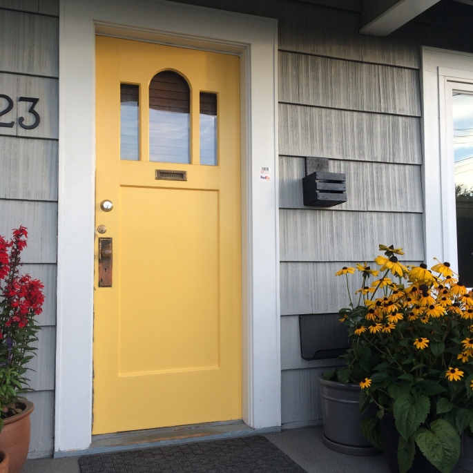
But let me go back to the beginning. The poor old door has been white for 10 years…I always hoped to put some colour on it. The house got painted this year, and a new roof put on…it was time!

So how does one go about choosing an accent colour? I do look at houses and make notes about what seems to catch my eye when I’m out for a walk. There’s also context: it does matter what color your neighbours already have, when making your choice. And, of course, what will go with your exterior house colour… and what will it look like when the door is open into your interior?

I landed on red or yellow, to go with my light gray house that has white trim. I thought it would be a nice pop of colour and contrast well.

Here’s how I usually go about making a decision – at my place – or at my clients’ places.

1) Since I’ve narrowed it down to red or yellow, I go through the paint chip box and find many, many chips of those two shade families. I don’t want the red to look “pink” at all, so I’m sticking to rusty reds.

door many

2) I don’t “narrow down” at this point, because I find the various paint chips will look different when viewed in place. So this is the next step: tape them on the wall or wherever they will go and view them there… All of them.

door some

3) Now start to narrow down, to a half dozen or a few candidates. Live with these for a while. Look at them during the day, and in the fading evening light, or at night with the porch light on. I walked out to the street to see what they looked like from there. And another time I drove home and parked out front and glanced up to see what they “felt” like after not seeing them for a while. This will sometimes change your mind.

door few

4) Then narrow down to the finalists. I was torn between the red and the yellow…I know the rusty red would look better inside, in the living room…but I know reds do fade in the sunlight, and I thought that would mean the colour wouldn’t stay as sharp for as long on my south facing porch. Plus, I had some fabulous Black Eyed Susans in some pots – so yellow it was!

I’m happy with my happy coloured door. I know it will look bright and warm in the grey wet months later this year, and it will inspire my planting next spring too.

Styling in an Instant

I’ve found a new art form. One that is immediate, easy, fun, and infinitely creative.

I worked in advertising prior to returning to school to study design. In design school I found our Theory Plate exercise (dubbed Pinky Plates for the U of M professor who initiated this process) such a fun exercise. It allowed me to use my nascent skills and understanding of the principles and elements of design and put them to work: organizing a layout, finding balance, playing with scale and colour, as well as shape/mass/form.

It’s been a while since then….I’ve spent 25 years as an interior designer by day and an artist by night. In the last ten years, single home ownership and motherhood has taken a lot of my free time – there hasn’t been much space to create art, in the form of painting, although I keep saying “I’ll start soon”.  I’ve realized though, that I have been “creating art” continuously, as I carve out a creative existence and live artfully every day.

I’m loving working on a book right now, which is the documentation of that creative experience, and I’ve chosen this as my priority to pursue right now. I’m really enjoying it. Along with that, and to support that, I’ve been blogging here on WordPress and posting on Instagram. Instagram has opened a door to a whole new world of visuals and inspiration. I’m following food bloggers, stylists, photographers, and foodies from all over the world.

When I first saw some of these stunning images, in particular a gorgeous aesthetic that’s coming out of Scandinavia right now, I thought: “OK! I GET this…I can do this….” It had never occurred to me to take, let alone stage, photos in such ways. Of course at first I thought I would mimic or replicate some of the styles I saw, but I quickly realized that I had my own style developing.

Now I go through my day and I find all kinds of opportunities to capture and document beauty and design. How to show a particular meal in a beautiful way, share a gorgeous view of something, a captivating leaf or flower. It’s made me up my game. And I’ve found that it is second nature, and it flows with ease.

I pull a piece of beautiful fabric for a complementary background, I wander into the garden for something to add that accentuates the visual. I look in the cupboard for a beautiful dish or plate. All this happens in five minutes or so.

I usually lay things out on the back porch, where natural light abounds, but is soft and gentle, without hard shadows. No additional light required, and usually no filters needed….

I find it’s like painting….instantly… I snap a shot or two with my phone. Then, if it’s a meal, I sit down to eat. Maybe it’s a visual blessing of sorts; creating some reverence for the bounty we usually consume in a less mindful state….As I try to eat healthier, slower, more mindfully, I find this practice enhancing that experience.

styling meal

I dug up my original Pinky Plates, from my first year in design school, 1987. I still like them.

PP1

PP2

PP3

PP4

PP5

PP6

PP7